And the Winner Is...
The Art of Applied Visual Thinking
So my family did a thing during the first week of vacation that I wouldn't admit to my doctor. Don't rat me out, please. It but was a lot of fun to do once, and it inspired a fun family visual.
We spent the hottest part of a heat-wave level day in the air conditioned car on a road trip, sampling ice cream from three top-rated ice cream shops in Eastern Massachusetts. New Englanders, in case you haven’t heard, LOVE their ice cream, and can have VERY strong opinions about it.
This was not a proper tasting, as we didn't all sample every flavor. Some flavors were just too good to share. However, we took notes on the flavors sampled and each rated our choices on a scale of 1-5 stars. Here is a single panel visual map of our excursion including flavor rankings.

Visual maps like this one can be a fun and shareable way to capture memories and keep records. AND, a visual map can become a valuable tool for decision-making by placing the various decisions or processes into a context that can be understood at a glance.
Here's what I mean.
Say, for example, I plan to take my team for a summer ice cream excursion. There are 46 people with strong opinions, and we need to select one ice cream shop and preserve the peace.
ICE CREAM SHOP VOTING
Step 1. VOTING:
From a long list of generally popular ice cream shops, I have narrowed down the choices to a reasonable number based on logistical criteria. Everyone receives a ballot like the one pictured here, with the various choices in the left-hand column. There are three columns to the right containing ovals that can be filled in to rank first, second and third choices. Voters can rank as few or as many of the choices as they like.

Step 2. ROUND 1: Once all the votes are collected, the first choice votes are tallied. If one of the ice cream shops won over 50% of the vote (in this case 24 votes), it would win. In the example shown, this is not the case. Kimball Farm won 13 votes, New City Microcreamery took 17 votes, and West End Creamery 16. Therefore, the voting moves on to Round 2.

Step 3. ROUND 2: First, the shop that came in last place gets eliminated – Kimball Farm with 13 votes. Then the second choice votes from each of those ballots are added to the votes for the remaining shops. Let's say 5 people selected New City as their second choice, 8 chose West End Creamery as second choice.
NOTE:
If there were more choices, this process would be repeated and ballots revisited to tally third, fourth, fifth, etc. choices preferences.
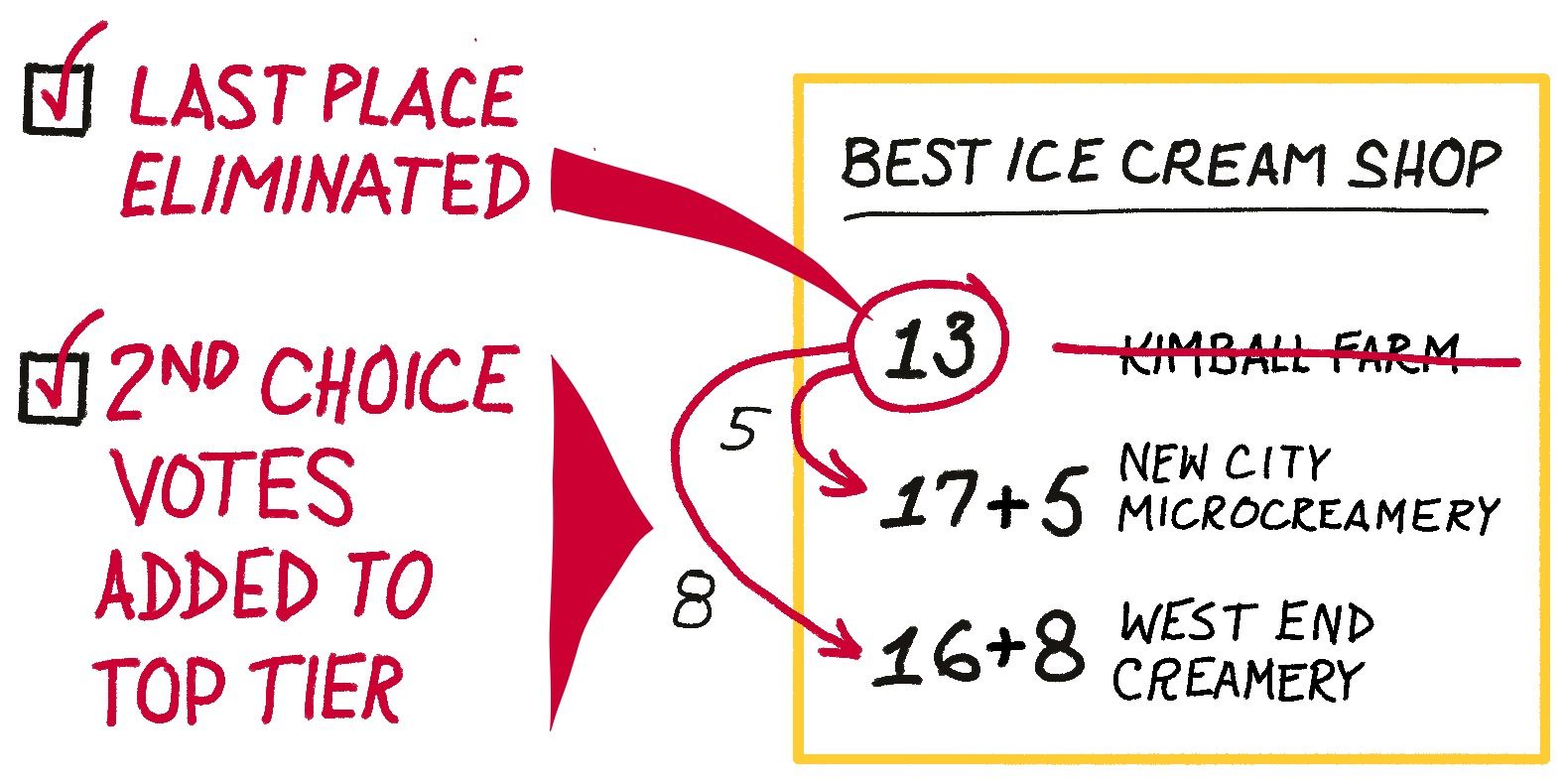
Step 4. WINNER ESTABLISHED: In our example, after second choice votes are added, New City Microcreamery squeaks out the win with 24 total votes. All ballots are considered, and nobody feels like their vote didn’t count. A fair win means no complaining.

While this example involved ice cream, this is a newish method of voting that has been adopted in some local elections for political candidates, called Ranked Choice Voting. The big idea is that voters’ preferences are not lost if their top choice candidate doesn’t immediately win over 50% of the votes. If a candidate is appealing but unlikely to win, voters can still vote their hearts without feeling like they are throwing away a vote.
Ranked Choice Voting is a complex process, but at AVT we believe in the power of visuals to make complex ideas easier to understand.
NOW YOU TRY.
Similar kinds of physical mapping with ranking can come in handy in any number of other scenarios, too, for both personal and work settings. Get your feet wet with one of these activities, or adapt one to create your own helpful visual mapping tool.
Create a Map
- Draw a loose map of a route you take every morning, indoors or out.
- Print/draw a map. Mark where your customers/teammates/relatives/friends reside.
- Sketch your kitchen with areas identified by activity zones, such as washing, chopping and prep, cooking, eating and socializing.
Do Ranked Choice Voting
- Where to spend a summer weekend
- Favorite local destination
- Where to go when it's too hot/cold/rainy

